PREDIX
Branding + Visual Design
Predix Branding Background
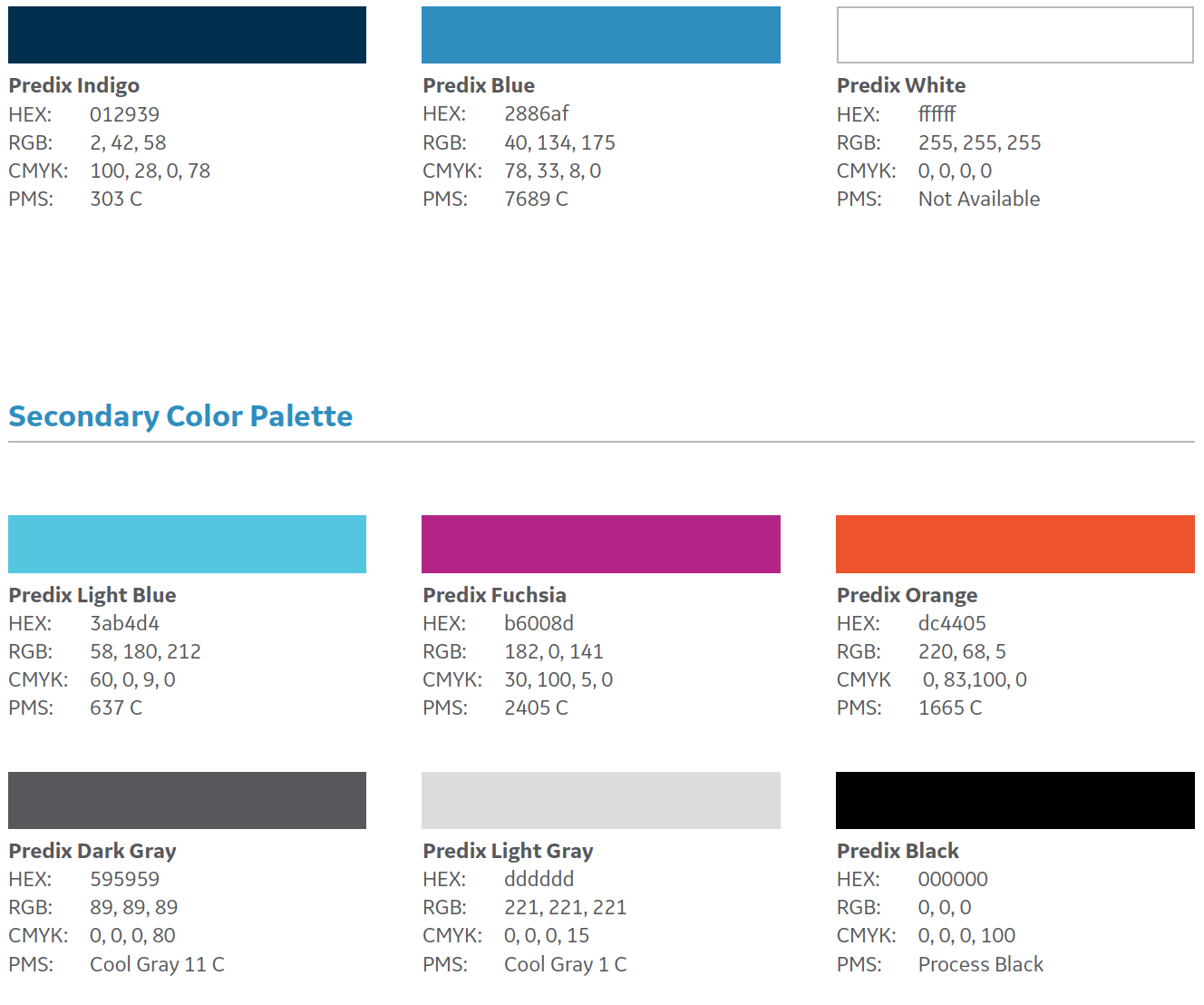
GE’s Predix Platform is the platform for the Industrial Internet–connecting machines, data and people to power the digital industrial companies of the future. We needed to develop a brand identity that connected with our community of builders, including developers, field operators, and executives.
In partnership with Liquid Agency, we built a visual design system that is fresh, connects with the technology community, and is “ownable” for GE. Through the use of color, typography, photography, pattern, and shape, we built a system flexible enough to be expressed from a small inbound ad up to large environmental experiences.
Solution: Branding, Creative Direction
Deadlines approach. Time to whip out the pencils.
We developed a new Predix logo mid-2016, but still needed to define a broader visual design system. During the process of building this system, we hit a road block where we struggled to build a system that was unique and ‘ownable’ by GE.
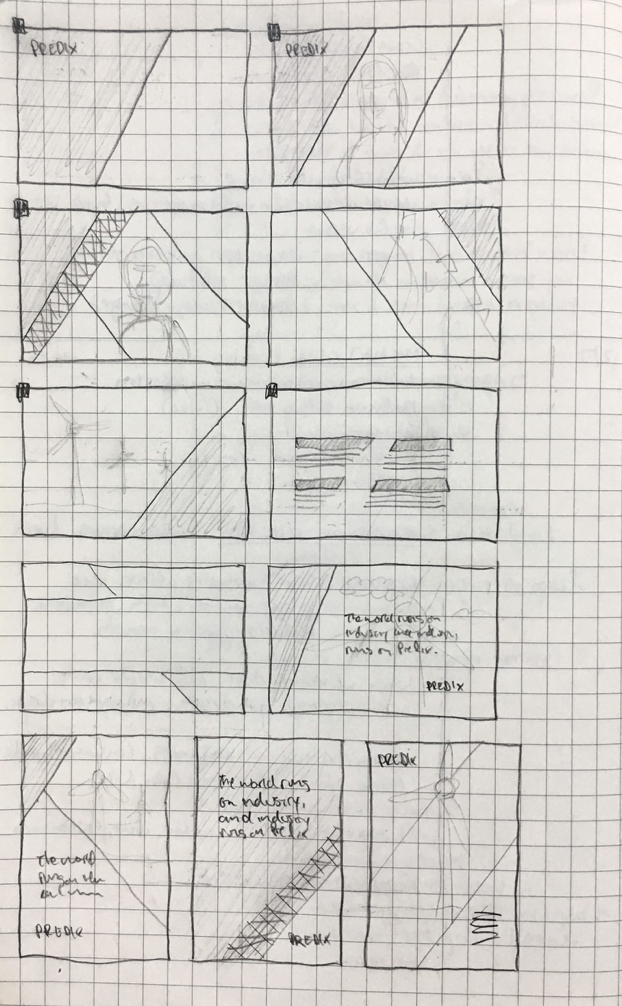
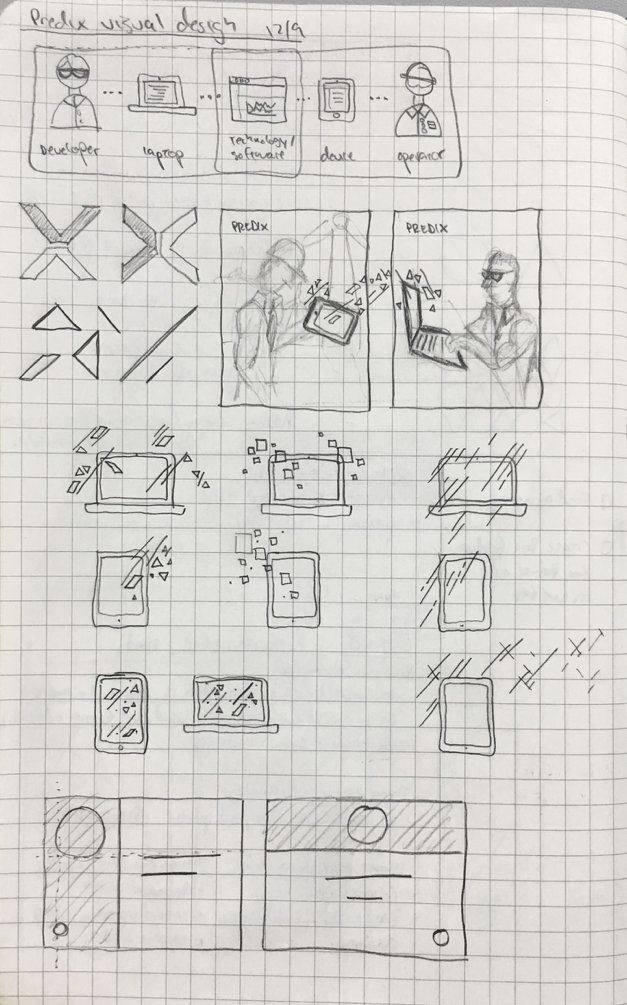
With deadlines approaching, I pulled in a few designers for a fast-paced brainstorm session. Our collaborative creative sessions usually start with defining a long list of words that reflect the characteristics, impressions, and goals of the project. We then move into a time of quick white board sketching where anything goes. There are no bad ideas. We then split up for some individual sketch time (15-20 min). After coming back together, we share ideas with the team and identify the strengths among the ideas.
X marks the spot
As we looked at the Predix logo, we realized that the X was a uniquely defining element of the logo mark. We started to lean on the X as the foundational element of design for the broader system. After deconstructing the X and looking at some of it’s core design elements, we built a system around the ’Predix diagonal’ which mirrors the same angle of the X. This became the foundation of a design system that is both ownable and flexible enough to activate across a wide variety of mediums.


